
Image credit: Heritage RESP
Heritage Education Funds is a leading Canadian provider of fixed-income Registered Education Saving Plans (RESPs) with almost 50 years in RESP experience. The campaign is targeted towards parents with young kids who are interested in securing RESPs. The landing page aims to generate their contact information in exchange for a comprehensive guide about Heritage’s RESP program.
The Challenge
- Determine which type of landing page would get more leads.
- Identify best landing page practices based on the study.
The Test
- We ran a search campaign for 5 weeks using the same text ad, keywords, and bids, but split the traffic to these two landing pages:
The Results
If you thought LP #2 performed better because it is prettier and looks more professionally designed, you’re WRONG!
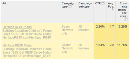
Surprisingly (or not), the much simpler LP #1 came out as the winner with a higher conversion rate of 13.25%, compared to LP #2’s 11.76%.
Because of this better performance, LP #1 also got a higher Average Ad Position (1.7), which in turn led to a better visibility and Click Through Rate (2.20%).
LP #1 is more geared for conversion success, and here are some of the reasons why:
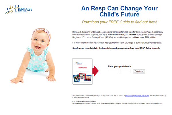
- Message match. The ad talks about “Building Canadian Children’s Future”. This was reflected in LP #1’s headline, providing continuity and ensuring the audience that they arrived at the correct page.
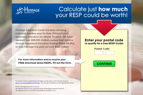
- Color contrast. The plain white background and simple page elements on LP #1 helped the headline stand out and immediately grab attention. Within 3 seconds, a visitor would notice the headline, read it, and grasp what the page is about. In comparison, there’s too much going on in LP #2 (busy background, big red arrow). The eye tries to take in everything at once and it takes longer for the mind to register what the page is about.
- Highlighted text. Heritage’s main advantages (“assisted over 400,000 children”, ‘paid out over $926 million”), as well as calls-to-action, were boldfaced for better visibility. These phrases would easily be seen, read and understood even by just scanning through the text.

Is your business facing a marketing challenge? Let us know and we’ll do our best to provide excellent marketing solutions for you.